Sunday, 30 March 2014
Final poster image
This is my final poster image with my billing block included. I will now await critical feedback on the poster from my media class and my focus group to make additional changes.

Saturday, 29 March 2014
New version
For this version I had to change the tagline font as the other font would make the entire document look blurry and unprofessional.


Poster Process
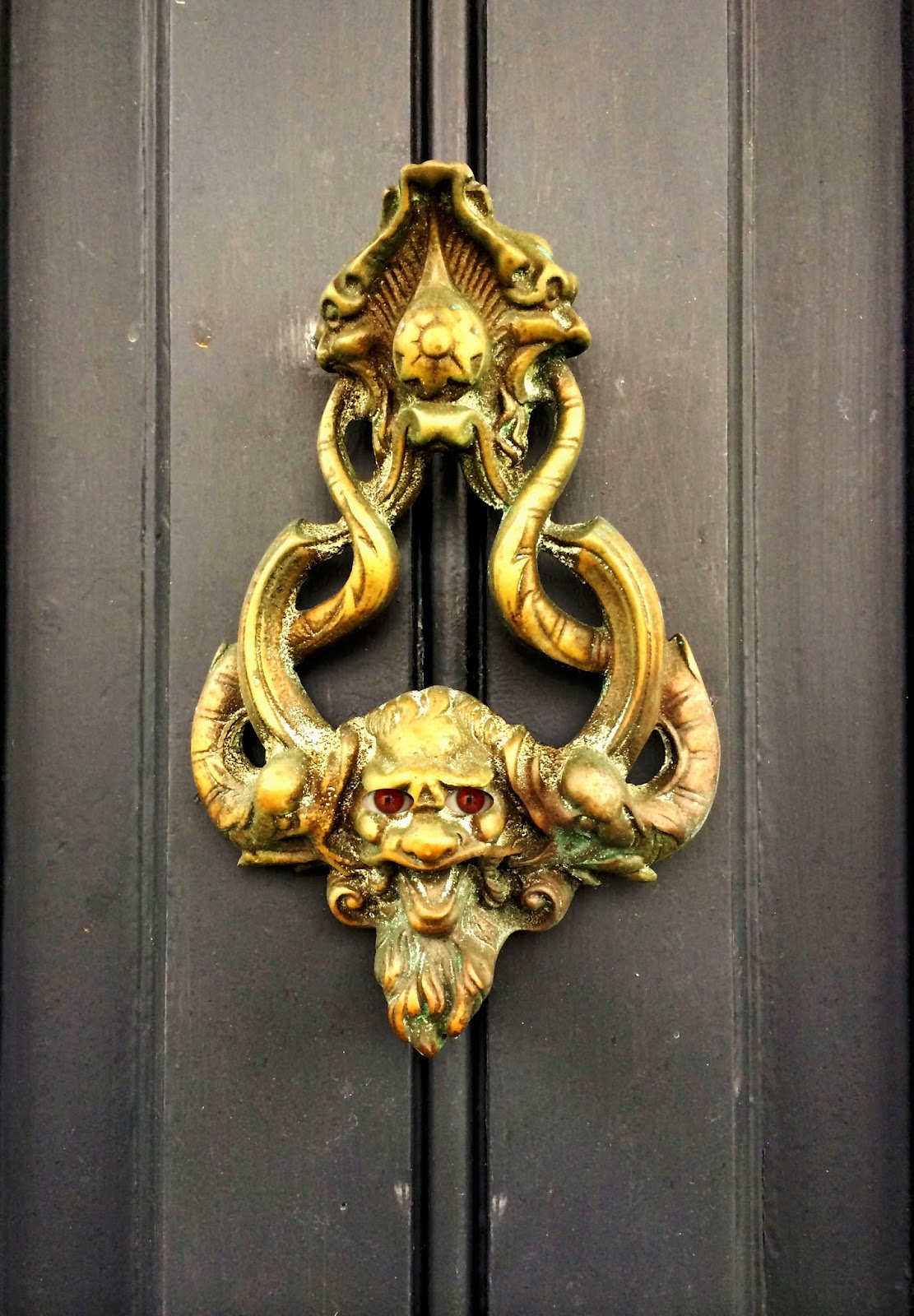
As part of the image for my poster process, there was a lot of Photoshop involved in order to create the image how I wanted it to be.
1) One of the main things I did was adjust the photo exposure, saturation, brightness and contrast. I did this in order to ensure my photo created a spooky effect and was dark and mysterious, rather than having bright and happy colours on it.
2) After applying my image, I also had to create the red eyes for my door knocker. This was complicated as I had to follow instructions from the internet in order to create it. I used this effect on my own eyes.
Before)
 After)

I had to do this by using the elliptical marquee tool in order to create a perfect circle around the iris. I then had to blur the image and create a "zoom" effect. To finally finish this off I had to pick a colour, which I chose red as it was supposed to represent an evil colour for my door knockers "eyes".
3) I then had to finally do the hardest part of the Photoshopping task. For this, I had to use a photo of the Head of the Asylum and put him in the centre of the door knocker. However, I found my Photoshop would not allow me to do it an easier way, so I had to do it in a way that a little more trickier. To do this, I had to use the lasso tool and draw a circle around it. I then had to put it onto the background poster and cut all the edges off by using the lasso tool so it fitted well in the centre of my door knocker. I then had to transfer the final image onto another layer on a different tab so it would fit and I could expand it without all the other edges on there. This was extremely difficult and took me a while to do it, but I finally did it in the end.
4) Finally, I then transformed the image with a different effect. I used an online editing programme to do this called FotoFlex, which allowed me to add dark shadowed edges to the poster and to add black and white effect, and then colour in the parts I didn't want coloured, which were the red eyes and the main image in the door knocker's centre.
Stages)
1)


1) One of the main things I did was adjust the photo exposure, saturation, brightness and contrast. I did this in order to ensure my photo created a spooky effect and was dark and mysterious, rather than having bright and happy colours on it.
2) After applying my image, I also had to create the red eyes for my door knocker. This was complicated as I had to follow instructions from the internet in order to create it. I used this effect on my own eyes.
Before)
I had to do this by using the elliptical marquee tool in order to create a perfect circle around the iris. I then had to blur the image and create a "zoom" effect. To finally finish this off I had to pick a colour, which I chose red as it was supposed to represent an evil colour for my door knockers "eyes".
3) I then had to finally do the hardest part of the Photoshopping task. For this, I had to use a photo of the Head of the Asylum and put him in the centre of the door knocker. However, I found my Photoshop would not allow me to do it an easier way, so I had to do it in a way that a little more trickier. To do this, I had to use the lasso tool and draw a circle around it. I then had to put it onto the background poster and cut all the edges off by using the lasso tool so it fitted well in the centre of my door knocker. I then had to transfer the final image onto another layer on a different tab so it would fit and I could expand it without all the other edges on there. This was extremely difficult and took me a while to do it, but I finally did it in the end.
4) Finally, I then transformed the image with a different effect. I used an online editing programme to do this called FotoFlex, which allowed me to add dark shadowed edges to the poster and to add black and white effect, and then colour in the parts I didn't want coloured, which were the red eyes and the main image in the door knocker's centre.
Stages)
1)
2)
3)
4)
Although this took a while to complete, I feel it went very successful and I await critical advice so I can make extra changes to the image. I have learnt a lot of different skills and have a broader knowledge now in using Photoshop.
Poster draft


Sunday, 23 March 2014

Saturday, 22 March 2014


Saturday, 8 March 2014
Template x2

With this template I have:
- Added an age restriction for our film
- Made the "13th" whilst adding a blood red colour to it
- Added the production logo
Poster Template
This is a template I have designed before creating my final version of the poster along with all the drafting.
I have done this so when I start creating my final version and draftings for my poster, I will be able to work alongside the template in order to know how to lay it out whilst having it as a mechanical template rather than my previous sketches on paper, as I think it will be easier to lay it out from doing so.
With this my final poster I will copy this template the exact same, but the image will be different. I have done this as I will need a template to use for my final version when it comes to taking my new image and putting it onto the poster. This templates' image is an idea of how big the door knocker of my image will be and how much room it will take up. However, the difference between this template and my final poster will be that the image will stretch out throughout the whole poster and the background will be gray instead of green as it is in the template. However, the eye of the image being the door knocker will stay in the same place it is in the template. This version of the template does not have the full billing block as of yet.
This is a list of fonts I have used for each part of the poster:
[ADOBE INDESIGN REFERENCES]
Tagline: Vani. Size 27pt. Stretched to 70pt.
Title: Engravers MT. Size 81pt. Stretched to 40pt.
Billing block: Orator Std. Size 17pt. Stretched to 110pt.
Date: [December] Orator Std. Size 25pt. [13th] Orator Std. Size 35pt.
Subscribe to:
Posts (Atom)