Thursday 16 January 2014

A comment on my first drafting of my poster from a target audience member.

These are some of the photos that I found that I wanted to create my design of my poster to be similar to.


One of the main reasons for this was my critical analysis comments. I found that these three posters had simple yet frightening main images in the middle of the poster, and then had the film title under the main image and the tagline on top.
I asked for some comments about my drafting of my film poster from someone who was part of my target audience. The person I asked was a female of the age of 33. She enjoyed psychological thrillers and her favourites were Sinister and Insidious. Her comments on my poster were as follows:
-         I like the bottom of the poster where it gives you links to the film’s websites such as Twitter, Facebook and its directory website.
-         I think the image would be effective, yet it is hard to comment on its complexity as I am not able to see the actual image as of now. I do, however, think that the image would draw me in and make me want to see it.
-         I like the film title, but I feel the font should be more sketchy and creepy.
-         The tag line does not make sense to me, and this is a negative of the poster.
-         I am intrigued to see what the logo would be, and I would hope it would be something scary.
-         What colour would the background be?

I will take these comments from a member of my target audience and think about how I will apply these comments to fit my target audiences wants. 

The poster I will compare my poster to is the Fright Night poster.
The differences between these are that my tagline and this specific poster’s tag line are swapped with the film title. This however, after reviewing my poster’s critical comments, is something I would like to change, so this aspect of our posters would be similar.
Another difference between this poster and mine is that I was dark grey/black colours for my posters, and possibility of black and white; whereas this poster has a blue hue colour to it.
Both posters have some indication that something is going to happen inside rather than outside. This is because my poster is going to have a door knocker on the front, symbolising the mental asylum as it is an iconic image. Whereas the Fright Night’s poster has the house on a street with an only light shining down from the moon, with a scary face rising above it, showing that something is likely to happen within the house, setting the mis-en-scene for that film, which is something I wanted mine to do. However, I did not want to have a picture of the full door as my poster like Fright Night has done with the full image of the house on the street, as I wanted more questions to be raised so it had more codes of enigma.

I also, after reviewing my first draft of my poster, wanted the billing block to be similar to the Fright Night’s poster, as it was spread out and easy to read, therefore establishing the characters and standing out.

Critical Comments on my poster from classmates:

My first sketch of my poster was a rough draft, but I asked my class mates to give a few comments on this design and layout. These are some of the comments people said about it:

- Not too sure on the image as I had not sketched it on this draft
- How many faces on the main image? Would it look cluttered? More than 2 faces would make it cluttered in my opinion
- Tag line could be worded better
- Tag line too vague, won't leave where/why? But also slightly awkward in its phrasing
- What will the logo be?
- Possibly swap the title and tagline around
- The hashtag and websites/emails are good
- Like the idea of 'uncover more' + social media link
- Bottom is unorganised
- Billing block is too far up
- April 10th, possible change to April 13th?

In thanks to these critical comments, I am going to take them and use them to rearrange my poster. Here are the number of things I am going to change:
- I will make sure a sketch is on the next draft, just without the faces embedded on the sketch.
- I will keep two or less faces/bodies on the poster.
- I will place the logo at the bottom of the poster along with the websites and addresses
- I am going to swap the title and tagline around so I can see which way fits better
- I will organise the billing block
- I am going to change the date to April 13th instead of April 10th

This is my original first draft of my poster.

Film Magazine Cover Analysis:

Tuesday 14 January 2014

General analysis of EMPIRE film magazines

I found from my film magazine covers a number of different things.

1) I found that the masthead was usually over layered by the actor.
2) The actor was usually over layered then by the splash.
3) I found the main colour scheme was red, white and gold.
4) The background colour was usually a plain dark colour or a dark mis-en-scene colour.
5) The magazines usually promoted different genres of films, trying to attract a wide audience. However, there were examples where they did not do this.
6) The actors were usually in their costumes and posing as their characters, rather than as they actual selves.
7) The magazine usually gave readers the appeal of feeling important or having a better advantage than others if they were to read the magazine.
8) The bar code did not have a strict place where it always was, but it was usually slanted diagonally.
9) The M on EMPIRE usually had the issue date and price above it.


Film Magazine Cover Analysis:

Like the other's I have looked at, this magazine's masthead is over layered by the main image of the character. The masthead is a bright red on a dark background.
The film splash is of the film's title "I AM LEGEND" and they have put the word "legend" in bold to emphasise the film. The "I AM" of the splash film title is in white, contrasting with the background, and then has the "LEGEND" in a contrasting colour against Will Smith's costume.
Underneath the masthead in small writing it says "THE WORLD'S BIGGEST MOVIE MAGAZINE" making people think that buying it will give them the most information than any other film magazine could.
The footer bar does a similar thing to another magazine cover I have analysed by EMPIRE, which is having it slightly slanted. It then contains 4 subsidiary images of different films which all contain an action genre, with the words "AND 20 MORE>>" making the indication that if you turn over the page there is more "Complete Access" to different actions films, making the film magazine cover very action based.
There is also another small title with "25 world exclusives! On set with every movie that matters this season..." which would make readers feel that they are important as they get to see the sets of every movie that "matters this season", making them feel that they have extreme importance for being able to have more information on important movies that will make a change this season.
This magazine cover mainly targets action film fanatics, as all films mentioned are action based films, such as the main film "I am legend" and others like "american gangster", "rambo 2", "tarantino", etc...
The issue date is above the M in EMPIRE again also, and the bar code is above the footer bar.

Film Magazine Cover Analysis:


The masthead stands out as the background is a dark grey colour from the mis-en-scene of the film.

The masthead is then a bright red colour which is over layered by the characters from the film.

The splash in similar to the masthead in the fact that it is bright red and white, standing out from the dark colours in the background. However, the splash over layers the character’s this time.

The splash stands out as the film is a well known film with “Here come the elves: “Less wise… More dangerous!” This will make it appeal to the reader to make them think “What will the magazine uncover about the elves?” making them want to purchase it.

The issue date and price is in between the “M” on the masthead of “EMPIRE”. This is a clever placement of the price and date as it can be easily found.

The footer bar is placed along the bottom but turned on an angle making it start from bottom left going up diagonally to the right. This could have been placed in this position to make it more creative and challenging the codes and conventions.

The bar code is then at the bottom right of the footer bar.

The main image is of the character’s from The Hobbit dressed up, but in their characters attire and posing. They are posing fiercely, showing the genre of the film will be fantasy and action.

The subsidiary images are at the bottom, of the footer bar, and it says “32-page comedy special!” on red background with white writing.

It then contains 3 subsidiary images of actors from comedy genre related films posing in their character’s attire. This then will appeal to a wide range of film fanatics, as it reaches an action and fantasy genre, but also a comedy genre, which are completely different genres.

The footer bar also contains a box that says “Plus: Ben Affleck’s next thriller!” which shows the magazine appealing to a thriller genre also.

Monday 6 January 2014

Enclosed: Film Animatic Analysis

An animatic is a preliminary version of a film, or in my case, a film trailer. This is done through shooting scenes from a storyboard, and adding the soundtrack to make it visual. It could be considered a template for the film or film trailer.

The process of an animatic is relatively simple. I started off with a storyboard for my product. Our storyboard was 5 sheets of A3 paper, which we eventually had to cut down to 3 as we had too much. As we went through our work and did revisions on what we needed and what we didn't, as some of our work we had too much of. 
After the storyboard is complete, and revisions have been made, you must put paper ideas to visual structure. You must do this by making a shooting schedule, where you take shots of your storyboard in person. This is an example of us using our storyboard and putting it into animatic.

This is a picture of a scene where Cecilia gives the baby to her father as she goes away to a Catholic school.


This is an example of putting our storyboard into animatic, ready for our final product. 
The final part of the animatic is adding a soundtrack and editing it. We edited it by showing any flashbacks for the film trailer in black and white, and present day in colour. We also added non-diegetic music over it, with three different soundtracks to enhance a creepy feeling. We then added diegetic sound to our product so we could visualise it ready for our trailer, and see if it worked ready for final product. We decided what we were going to say after we made our own script:
This is part of it.

Our narrative relatively stayed the same as we decided from the beginning, with very few changes. However, we did want to take out certain parts in the storyboard. This is for different reasons such as it was either too much time being taken up, or it was too structured. this is a list of our revisions.
- We found that our storyboard was relatively long, so we all went through it and took certain scenes out of the animatic, so we could then follow the animatic trailer from the storyboard.
- We took out the scene of the doctor going to work and speaking to his wife about his new job. We felt it was too structured and time consuming.
- We took out scenes of a patient being injected with a needle after an episode he has. We did this as it was time consuming and we thought of other ideas to show the insanity in the asylum with less timing. We also found it could be a health and safety issue.
- We also took out any visual scenes or implications of killings, and instead used another patient being dragged down a corridor, and the doctor being taken by the boy in a mask when he wasn't looking. We did this because we didn't want to show too much blood or gore as it may imply that the film was a horror genre instead of a psychological thriller. 

We used our storyboard as a process of creating our shooting schedule. We did this by first of all figuring out what characters we needed together on specific days. We found some difficulties in the animatic process however, as when we were planning to shoot, one of our lead characters wasn't well enough to shoot. We then had to use another character as the boy, but it wasn't too hard as we were using a mask for these shots. Another problem we had was the original actor for Cecilia didn't come in for another shooting day at the train station, but we decided to use Jess from our group to do that part for the animatic. Other than this, however, our shooting schedule was organised well and we completed everything we needed to. 
We had five different days for shooting, and altogether it took eight hours to finish all the shots we needed. We did not expect it to take so long, so now we are prepared for our shooting schedule for our final film trailer product. 

We used two different locations: the asylum, and the train station. 
Our main shots were in the asylum, and we used the train station for Cecilia to give the baby over to her father. 

We used a set of props also:
Tray with bottles on it [for medicinal scene]

Mask for the boy

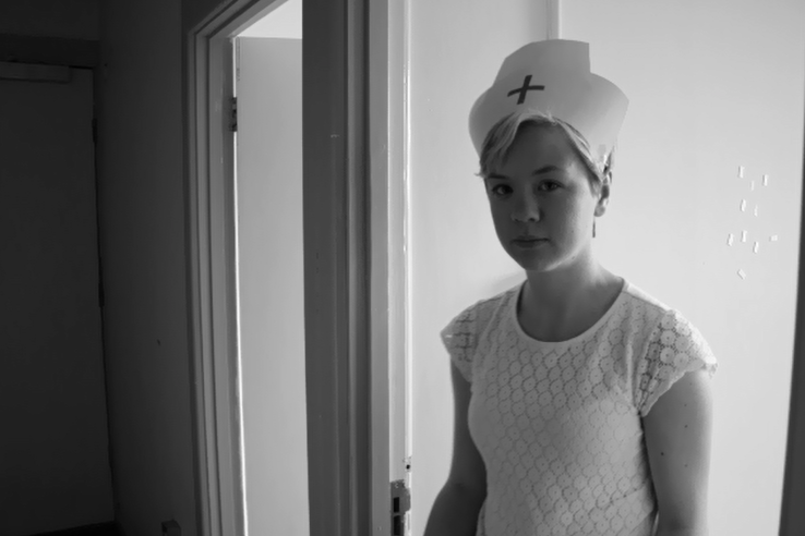
Shirt and tie for doctor's part; white shirt and black skirt with nurse hat for Cecilia's part; nun's outfit for Cecilia's part; white shirt and black trousers for boys part

Paper documents for the scenes where Cecilia's father/Head of the Asylum throws it off the table, and then the doctor finds it

Cross necklace to show the father giving it to Cecilia to represent the religious side

Baby doll for the scene where Cecilia gives her baby over to her father

Blade for the cutting scene

Saw for the part where the boy drags a patient down the hallway


We discussed our possible actors by how we wanted to represent them. We wanted Cecilia to be blonde and look innocent.

We wanted the boy to have a baby-ish look to him, whilst still looking sinister when he could.

We wanted the father to look assertive but also be able to have an angry streak him in for the argument scene.


The doctor we then wanted someone who looked smart.


There weren't too many revisions as we knew what we had to do after making revisions of our storyboard. However, we did add a jumpy scene, where the doctor gets taken, and an creepy scene where the boy drags the patient down the hall. There were no shots we were unable to do, as we improvised with whatwe had for our animatic. We were unable, however, to show the scene where the nun Cecilia is smuggled in by the doctor. This was because we were under a strict time frame and we were unable to do it in time. However, we feel this is a key scene and we definitely want to include it within our film trailer product.

The scenes we added with the jumpy scene and scary scene were creatively added, as we explored the location a bit further and found extra rooms, so we decided to use these to our advantage. This is such as using the Head of the Asylum in front of the stained glass window to represent the religious context and the father's anger towards the psychiatrist. 

During the editing process we constructed our animatic by making some of the storyline structured so it was not too difficult to understand, but we then mixed a lot of the scenes up so the narrative was not in a linear order so it would leave more questions in the code of enigma. We then got our photos in order, and added our soundtrack on that we got for free from a free website. Once that was structured, we added transitions in and our intertitles. Then, we added our voice overs.

We chose the length of shots and transitions by watching it repeatedly to see which transitions fitted best, and how long the shots should last according to our script, and then by how long it looked best fitted. We found we used a lot of fading out transition as it created the questions of what is going to happen next in that scene? Our trailer lasted 2 minutes 22 seconds. We felt this was a good timing for our trailer as it is a typical timing for a psychological thriller  to last. We also found some shots lasted than we predicted. This was particularly because we left out our key scene of the doctor smuggling the nun back into the asylum, so we extended the shots. However, when it comes to our real product we will change the amount of time for these shots. 

We came up with our "Enclosed" title to suggest that the asylum "enclosed" mysterious secrets and an evil past. This was clearly shown with the minimum of locations we used, to show the title referred to the asylum. The font we chose for this title was used as it was quite sketchy, which described the film and the asylum as a whole. We used this same font for our production name "CutThroat Pictures", which represented the genre of our film. We gave this font a blood red colour also on a black background, to show it was a threatening and scary film. We also had the intertitles of "When your home is an asylum..."  which left the viewers on a cliff hanger to carry on watching, and then added on "Who do you trust?". This was done to show nobody could be trusted in this building, and trust is scarce whilst being in this asylum. We also found this gave a code of enigma too, which is "what secrets will be uncovered?" or "what secrets are enclosed in this asylum?" 

We were really pleased with our choice of soundtrack for both animatic and our film trailer final product. It started off slow and creepy, which we found most psychological thrillers do. Then, when our disruption of equilibrium happens with the rape scene, the music is fast paced with violins and joined by a guitar, which makes the film trailer tense and worrying. This sets a faster pace of our editing. 

Whilst making our final product, I will improve on a lot of things. These consist of:
Time frame
- I will work on this so there is more time planned if needed, and also for any disruptions, such as actors being off ill. I will do this by organising better schedules with specific scenes that need to be done on that day, making our schedule more organised and structured.
Structure
- I will try to make more questions for the audience in our film trailer, enhancing the codes of enigma. I will do this so I can raise questions where they have to think "What just happened in that trailer?" and "What's going to happen now?" so the audience doesn't understand the film trailer and what's going on in it, making them want to find out and watch it.

Key Images:


1) This is a key image for our animatic as it is the assault scene. This is a key image as we had to deal with this part of the trailer in a very delicate and sensitive way, so we didn't show any details, but only implied it. This meets our target audience as we wanted our audience to be able to have sympathy for Cecilia in the trailer, and throughout the trailer want our audience to feel that things are bad in this asylum, also being able to represent the state of asylum's in earlier years, showing they can not be nice places. This is part of the flashback.


2) This is another part of a flashback. I felt this is a key image as it shows the film has a religious background, which is usually linked with supernatural happenings. This shows us breaking the stereotype of religion being used in a good way, but instead we have used it in a sinister way, by showing the father has used religion to his power and his wants, rather than in a good and helpful way, which religion is represented as. We have also shown the stereotype of men overpowering women, as the father's hand is raised above Cecilia's, which we wanted to represent the idea of the father thinking he was "above" her, as he hands her the religious necklace. This would reach our target audience as we wanted both a female and male audience, and the connection between both genders is a main topic within our story, as we wanted to represent stereotypes of genders, making both genders in the audience understand the stereotype.


3) This is a key image as it is of present day, and represents the Head of the Asylum being angry and shouting. We wanted to have this key image as we wanted to show the audience that the asylum was under control of someone aggressive and with a temper. We did this to appeal to an audience so they could relate to a possible over-protective father at the age range we were targeting. 


4) This is a key image as it is one of the images at the beginning of the trailer where the doctor knocks the door to enter the asylum, and then as the trailer ends it zooms out of the asylum with the door shutting. We did this to target an audience who like psychological thrillers, as the closing of the door represents our idea of secrets being locked away in an asylum, and it dares the audience to come and find out what secrets are enclosed.


5) This is the final key image. This is because it is part of the jumpy scene at the end, and it represents our psychological thriller, as one of our main protagonists is being taken by someone in a mask, which raises the audience's question of who is behind the mask? It reaches to our audience also as the doctor is presented as a young doctor of 20-23, which is part of our age range target audience.

In the group we all participated in similar tasks, but took control of other tasks. We all took part in the shooting schedules, and taking the pictures, and having some kind of acting part within the film, even if it was a little or big scene. However, we all took responsibility of other tasks. I have a big role in organising the script, and sorting out intertitles which I have produced on PowerPoint ready for our last finished product. I also kept track of our revisions and our shooting schedule timings, showing an organiser of our schedule. Harri had a big role in creating the storyboard, and did a lot of the editing, as he is artistic. Jess then had a the role of casting, organising the shooting schedule with actors, and came up with the narrative of the story, as she is creative. With all of us being able to contribute to different parts of the film animatic, we were able to complete a successful animatic product. If we had done everything together, however, we would have struggled to make enough time to complete it all, so we had certain roles. We will continue to use these roles to our advantage for our cinematic version, whilst having individual roles along with group interaction roles, such as taking pictures and organising the rooms to fit our needs.

Sunday 5 January 2014

Revisions from Storyboard

We found that our storyboard was relatively long, so we all went through it and took certain scenes out of the animatic, so we could then follow the animatic trailer from the storyboard.

- We took out the scene of the doctor going to work and speaking to his wife about his new job. We felt it was too structured and time consuming.

- We took out scenes of a patient being injected with a needle after an episode he has. We did this as it was time consuming and we thought of other ideas to show the insanity in the asylum with less timing.

- We also took out any visual scenes or implications of killings, and instead used another patient being dragged down a corridor, and the doctor being taken by the boy in a mask when he wasn't looking. We did this because we didn't want to show too much blood or gore as it may imply that it was a horror genre instead of a psychological thriller.


Animatic Shooting Schedule

Friday 29th November - 1 hour
 Basic shots of asylum
Thursday 5th December – 1 hour
Shots of patients, other basic shots of asylum
Friday 6th December – 2 hours
Shots of exterior and patient’s rooms
Tuesday 10th December – 1 hour
Shots of chapel scene, scary/jumpy scene
Thursday 11th December – 3 hours

Finished the rest of the shots for our animatic

Poster Analysis: The Conjuring


This poster conveys the film's narrative image by showing only dark and gloomy colours, with an almost spotlight look alike shining down on the rocking chair with a woman holding a doll that is looking directly at the viewer. This shows that the doll is a narrative and iconic image towards the movie, and with the title it displays a sentence of "based on the true case files of the warrens" which will stand out to viewers as it will be based on a true story, appealing to viewers as it will add to the thrilling of the story knowing that it is based on something that really happened. The image also shows the woman on a rocking chair in a white room with darkness surrounding her, representing insanity and adding to the thrilling feeling.

The film title is "The Conjuring". The Conjuring as a word means to summon an evil spirit or evoke it with a supernatural power. This already represents the genre to the viewer of the poster, showing that it will not be a rom-com or a love film, but will be a thriller/horror. It also represents the narrative, showing there will be supernatural happenings within the film, which will appeal and stand out to psychological thrillers.

The image of this poster is one layer, and it is surrounded by darkness on the outside, with a lighting on the woman and the doll. This could be done to enhance the fear to people, and it could also be done to raise questions. Such questions that may be raised on the poster are:
Who is the doll?
Has the doll been "conjured"?
Who is the woman holding her?
What happened to the Warrens?
Will it end good or bad?
The iconic image is also well represented of the genre, as it simply shows that the film will be a psychological thriller, instead of a horror, as there is no blood or gore involved, or anybody screaming which could represent the horror genre. From these two posters, you can differentiate the genres well.
The differences are clear, as The Conjuring gives you more of a spooky and chilling feeling, whereas the Saw poster gives you more of a horrifying feeling. This is from the blood shown and the fragmentation of the arm that has obviously been cut off, representing the title of "Saw".

This is taken from the poster of the two main stars, who are Vera Famiga and Patrick Wilson. Both these characters will stand out for the film as even though their faces are not shown, they are well known actors for being in this genre of film. Patrick Wilson is well known for Insidious and Hard Candy, whereas Vera Famiga is well known for Safe House and The Departed, which are psychological thrillers. 

The movie's tag line is "based on the true case files of the Warrens", which will also scare people and add to the fear. This may even have the effect on people to search up The Warren's case file before or after seeing the film.

The credit lines tell us that James Wan directed the film, and is a James Wan production. James Wan is well known for these film productions:
This shows what type of films to expect of James Wan's productions, and they are usually psychological thrillers or horrors. 

I feel the main appeal to the film poster about the film is the tag-line, which is about the film being based on true events. This is because I feel it will stand out the more than any other aspect. Another main appeal could be the main image, as it has a doll in which looks sinister, which shows the film poster and the film going against the idea of dolls being children's toys, and instead shows innocence being prevailed into something evil, that has been "conjured". 

I feel the target audience will be 20-30, as I think the doll will encourage young parents to see it as the doll could remind them of their own children's toys. It will also be a mixed gender audience, as both main stars are female and male, with both being protagonists, and representing a "heroic" image. The audience will also enjoy psychological thrillers and horrors, such as other productions of James Wan, like Insidious and Saw. This could also be the producers main target audience, as they state at the top of the film poster, "from the director of Saw and Insidious", which shows them trying to appeal to an audience who have seen this film. 

It's unique selling point will be the fact that it is based on a true story, which is the film's high concept, as it is unlikely for films to be based on true events, and if they are, they appeal greatly to an audience. Other psychological thrillers that have done this are Megan is missing and The Exorcism of Emily Rose.