Saturday, 10 May 2014
Thursday, 8 May 2014
Wednesday, 7 May 2014
Problems with our original location
Managing time with regards to filming has been difficult for our group as a result of problems with our chosen location. We originally made a shooting schedule, planning to have all of our filming done within three weeks. We were told however that we would have to postpone this by a month due to building work on Mulberry house.
We were initially prepared for this to be an issue as we were warned about it whilst shooting the animatic. In this regard, it was a shame that we weren't allowed to do any filming at the time we were photographing the animatic. At that time, the building had more of its original period features which added to our mise-en-scene, as our film is set in the past. When we were able to film we were slightly disappointed by the changes that had been made in the building, but at least we were still able to film in the cellar, conference room and canteen and chapel. We managed to shoot scenes of Harri (the psychiatrist) being led into the building up the steps, the interview scenes, and some patient scenes. We filmed Rachael as an extra patient, as well as a shot of Sean having a fit of anger in his room. We were also able to film Gethin being threatened by a knife,as he is one of Sean's suspects, (sean believes that Gethin is withholding information from him, and siding with the head of the asylum.)
It seemed positive when we were able to secure the first few filming sessions, but soon there were problems arranging dates again, due tobuilding contractors and health and safety supervisors.
In order to meet our deadline and get as much footage as possible, we decided to find a new location, whilst editing the footage we already had.
New Location
As a group we began discussing potential new locations. We felt that this would be more productive than waiting for possible dates to film at Mulberry house which our actors may not have been able to make, (especially if we were only given one day to complete everything.)
We started doing extra research of local locations, and discussing whether they would be appropriate, and what their advantages and disadvantages would be. We concluded on three main realistic locations, and contacted all of them. These were:
We started doing extra research of local locations, and discussing whether they would be appropriate, and what their advantages and disadvantages would be. We concluded on three main realistic locations, and contacted all of them. These were:

The Drama Centre
This building is just down the road from Mulberry House. It was one of our original considerations, but at the time we contacted, nobody was available. The building is large, spacious and also has period features. It is open regularly as more of a public building, so we felt that this would be good in terms of easily arranging filming dates which could last all day.

The Hill college mansion house
The Hill college is directly behind our school , which again would be perfect for accessibility. As a college, it has shut down and the building remains unused except for occasional venue hire. We hoped that this would perhaps mean that the owners/ whoever is now responsible for the building, would allow us to film there just for a day or two. The grand exterior would have been perfect for some extra exterior asylum shots, and the corridors inside the college building would have created a good representation for corridors in a mental hospital. We decided that this building would be the most ideal choice, and so called numerous numbers to find out who was now responsible for the site. It was difficult to gain permission as Coleg Gwent are still responsible overall for the buildings.
The Skirrid Inn
The Skirrid Inn has a massive reputation in Wales as one of the most haunted places in Britain. There are multiple stories about ghosts and hauntings as the building is so old. For this reason, we felt that the old features would create really effective mise-en-scene and create an overall creepy atmosphere. There is also an old stairwell which has an authentic noose hanging from the beam, where people had genuinely been hanged in the past. We felt that this might add some realism and clearly it was the perfect pre-set prop for a horror scene. It was however, the furthest away location and most difficult to access. We made calls to the Skirrid Inn but it was problematic asking for any more than an hour or two, and we were asked for payment to use the building for any longer than this time. As a result, we dismissed this location as a possibility, as it would also mean arranging transport for our actors and would limit our time.
Film trailer: Audience Feedback
As part of our audience feedback, we asked our target audience to watch our official completed film trailer and answer a questionnaire we produced for them. We asked a total of 9 people during this survey, whom did not have to disclose their identities so it would be a confidential survey, but were only asked for their gender and age. These are their answers.


These answers show that 1/3 of our audience thought that it would be a suitable production for 15+ year olds. However, 2/3 of our audience agreed that it would be most suitable for 18+ year olds. The target audience agreed that it would be too complex and scary for a younger audience, and that there were very sensitive scenes such as the rape scene, and a continuity of violence and torture within a mental asylum. One target audience member also agreed that it would be directed towards both males and females, because of the aggressive nature that would appeal to males due to a lot of action being involved, and females because of the narrative, as there is a lot of nurturing and maternal nature within the film.
This is our audience's reaction to the film trailer. At first it is clear they are having nervous laughs and smirking, but throughout it are gripped and at the end they are truly scared and feel unsettled through what they have just seen.
Question 1:
Please list 5 shots/scenes that were the most memorable.
Answers
|
Tally
|
Rape
scene
|
9
|
Gas
mask/table card scene
|
3
|
Boy
reacting violently scene
|
7
|
The
hanging scene
|
9
|
Doctor
argument scene
|
1
|
Train
scene
|
4
|
Patient
"Shhhh" scene
|
1
|
Knife
to man's throat scene
|
5
|
Baby
in bucket scene
|
1
|
Establishing
shot
|
3
|
Blood
in sink
|
2
|
Altogether, out of the entire trailer, 10 scenes were most recognisable for our target audience. It is clear to see from these scenes that they are all dramatic which would've caused the impact on the audience to stand out to them as the most memorable scenes. The hanging scene was the most memorable scene, which was near the end within the montage, and right at the end before the credits. This could have been due to the explicitly hanging man, and the assumable "innocent" soundtrack in this scene which is a significant contrast between sound and picture, making it extremely creepy.
Question 2:
How did the trailer make you feel, both physically and
emotionally?
As evident from the answers, they're all positive responses to the film trailer as it is a psychological thriller. It shows that it stands out, and doesn't make the audience "happy" or "careless", and shows it reaches the target audience well.There are both physical and emotional responses to their feelings, and "intrigued" and "on edge of seat" were the most popular responses, which was a great response. There were even responses of the audience feeling "sick" and "distressed" showing that the film trailer made them feel physically rather than just emotionally.
Question 3:
Please give your interpretation of the plot synopsis, and
the genre that you think was represented?
1) Girl raped, baby given to father to
turns him into a patient within the mental asylum, when a doctor arrives and
helps the patient.
2) Mental asylum, patients go off the
ropes, causing distress to the owner. The baby was possibly brought up in the
asylum?
3) Based in an asylum, mental patients, and
abnormal happenings.
4) Asylum, story based on the young boy.
5) Mental institute, patients are abused
and everything starts getting out of control, whilst trying to reconnect the
mother with her son who is the patient.
6) A nurse is raped by an unknown
individual, who then becomes pregnant. Too ashamed about the whole situation,
the child then stays in the mental asylum where he is brought up and becomes
mental.
7) Rape in mental hospital results in a
baby being given up and raised as a patient.
8) Mental institute set in the past.
9) The nurse was raped and her baby grew
up in the mental asylum. The baby was not treated very well and had a mental
breakdown.
This proved our product successful, as every response we had showed that the audience had understood our trailer's narrative, and had an idea of what was going on, and was not confused or misunderstood.

Question 4:
Would you be interested in seeing the full feature? Please
give your reasons why or why not.
Intriguing
|
2
|
Gripping
|
2
|
Interesting
|
2
|
Scary
|
1
|
Want to know what happens at the end
|
2
|
These responses were very positive for our film trailer product from our target audience, as our target audience proved it was the right choice and they all wanted to see it. This means that our film trailer had gripped the target audience's enough that they would want to see the full feature film, meaning it was successful.
Question 5:
What age group you think our trailer is aimed at? Please
give reasons for your answer.
Rape scene
|
Distressing images
|
Violence
|
Torture
|
Mental patients
|
Disturbing
|
Too complex and scary for younger
audience
|
Characters represent the age target
|
Directed to men because of aggressive
nature, directed to females through the plot
|
Murder
|
These answers show that 1/3 of our audience thought that it would be a suitable production for 15+ year olds. However, 2/3 of our audience agreed that it would be most suitable for 18+ year olds. The target audience agreed that it would be too complex and scary for a younger audience, and that there were very sensitive scenes such as the rape scene, and a continuity of violence and torture within a mental asylum. One target audience member also agreed that it would be directed towards both males and females, because of the aggressive nature that would appeal to males due to a lot of action being involved, and females because of the narrative, as there is a lot of nurturing and maternal nature within the film.
Question 6:
How well do you think our trailer compares with real
existing film trailers? Please tell us the reasons for your opinion.
1)
It is similar to real horror film trailers and
is set up well to look like a real trailer.
2)
Well because it grips the audience.
3)
It had a good, gripping atmosphere but the
acting could have been better.
4)
I think it sums up to a real existing trailer.
The trailer pointed out some of the main features from the film, just like the
real trailer. The trailer is also intriguing just like real life trailers.
5)
It had a good atmosphere, thrilling, keeps you
on the edge of your seat, interesting, a bit too long but very informative.
Good use of music.
6)
I think this trailer is unique compared to
others but would fit in with existing trailers. It is a really good trailer
including good transitions/soundtrack.
7)
It was very good. Provided the necessary information
for the audience to understand the plot but not enough to give away all the
details before watching the whole film.
8)
I think it was really good because like
professional trailers it built up the suspect well throughout. I think the
atmosphere it created was brilliant.
9)
A bit muddled up at times and needed some fuller
explanation, however left me wanting to see more which is more than can be said
for most current trailers.
These responses showed that the majority of people agreed that it would compare well with real existing film trailers, and pointed out parts of the film trailer which could have been improved. This has helped myself and my group to understand how we could've improved it which will help us in the future, as we were grateful for both criticism and positive comments.
This is an example of our survey and target audience member's responses:


This is an example of our survey and target audience member's responses:
This is our audience's reaction to the film trailer. At first it is clear they are having nervous laughs and smirking, but throughout it are gripped and at the end they are truly scared and feel unsettled through what they have just seen.
Thursday, 1 May 2014

Draft 3 Magazine Cover

I have also added a bar code, date and price as it is conventional. However, I found most film magazines when analysing them were around £4, sometimes more expensive depending on their offers inside such as special editions. As this is the case, I brought my price to £2.99, as it is a relatively reasonable price for a film magazine, but it also is a good way of marketing through putting £2.99 instead of £3, as it will seem cheaper.
Draft 2 Magazine Cover

The main coverline has been added which reads "Enclosed - 32 page special edition" so it will stand out as an important magazine that won't be found again as it is a "special edition".
There is also the taglines of an interview of the "Enclosed" main actor, which will appeal to audiences who love psychological thriller/horror films and are interested in watching the film.
There is also the tagline of a list of other horror movies within the magazine, which are considered the top 10 horror movies of 2014.
In the next draft I will move my 2014 top 10 movies up slightly so there is more space, i will add more selling taglines and add a bar-code, date and price.

Magazine Cover Photo Edited


I edited this photo with a background of black and white because I wanted to represent the doctor in this being surrounded by the black and white which in the trailer represents the past and the flashbacks. As he has "HELP" on his hand, I feel that because he is surrounded by black and white it looks as if he is surrounded and overwhelmed by the asylum's past and it's secrets, and it is dragging him back.
i also felt that the black and white would make it easy and clear for me to add magazine cover headings and titles and they would be able to stand out better alongside the black and white and dark colours.

Tuesday, 22 April 2014
Final finished product: Poster

With this I have changed the poster thanks to my audience feedback. These are the following things i have changed.
Billing block has not been changed at all
Changed the tagline's positioning to a scattered effect. I felt this represented the film plot well
Eyes have been given a more red effect in order to represent "the devil" showing the religious aspect of the film
Font has been changed to a blood splattering effect
Cross has been added to the "O" in "Enclosed" to highlight religious aspect
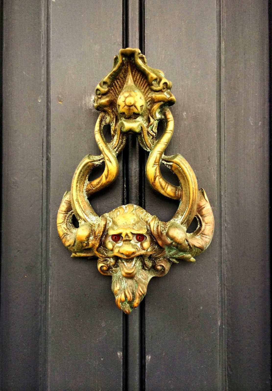
Face within door knocker has been turned upside down: My audience feedback showed it would represent the film well as it represents the lives of all the characters as being "turned upside down"
Added a more bright effect so the poster would stand out, i found the last poster was too dark and daunting which didn't stand out well
Audience feedback:
After showing media students my poster they were very pleased with the finished product. However, there were a few changes they wanted to see. These are the comments:
1) Main image stands out and goes well with the title
2) Eyes of the devil could be slightly redder
3) Face in the middle, could be lost? turn upside down and get rid of the shoulder
4) Don't lengthen the L in the title. Add a religious cross to the O in the title. change font - blood splattered?
5) Tagline reposition
Sunday, 30 March 2014
Final poster image
This is my final poster image with my billing block included. I will now await critical feedback on the poster from my media class and my focus group to make additional changes.

Saturday, 29 March 2014
New version
For this version I had to change the tagline font as the other font would make the entire document look blurry and unprofessional.


Poster Process
As part of the image for my poster process, there was a lot of Photoshop involved in order to create the image how I wanted it to be.
1) One of the main things I did was adjust the photo exposure, saturation, brightness and contrast. I did this in order to ensure my photo created a spooky effect and was dark and mysterious, rather than having bright and happy colours on it.
2) After applying my image, I also had to create the red eyes for my door knocker. This was complicated as I had to follow instructions from the internet in order to create it. I used this effect on my own eyes.
Before)
 After)

I had to do this by using the elliptical marquee tool in order to create a perfect circle around the iris. I then had to blur the image and create a "zoom" effect. To finally finish this off I had to pick a colour, which I chose red as it was supposed to represent an evil colour for my door knockers "eyes".
3) I then had to finally do the hardest part of the Photoshopping task. For this, I had to use a photo of the Head of the Asylum and put him in the centre of the door knocker. However, I found my Photoshop would not allow me to do it an easier way, so I had to do it in a way that a little more trickier. To do this, I had to use the lasso tool and draw a circle around it. I then had to put it onto the background poster and cut all the edges off by using the lasso tool so it fitted well in the centre of my door knocker. I then had to transfer the final image onto another layer on a different tab so it would fit and I could expand it without all the other edges on there. This was extremely difficult and took me a while to do it, but I finally did it in the end.
4) Finally, I then transformed the image with a different effect. I used an online editing programme to do this called FotoFlex, which allowed me to add dark shadowed edges to the poster and to add black and white effect, and then colour in the parts I didn't want coloured, which were the red eyes and the main image in the door knocker's centre.
Stages)
1)


1) One of the main things I did was adjust the photo exposure, saturation, brightness and contrast. I did this in order to ensure my photo created a spooky effect and was dark and mysterious, rather than having bright and happy colours on it.
2) After applying my image, I also had to create the red eyes for my door knocker. This was complicated as I had to follow instructions from the internet in order to create it. I used this effect on my own eyes.
Before)
I had to do this by using the elliptical marquee tool in order to create a perfect circle around the iris. I then had to blur the image and create a "zoom" effect. To finally finish this off I had to pick a colour, which I chose red as it was supposed to represent an evil colour for my door knockers "eyes".
3) I then had to finally do the hardest part of the Photoshopping task. For this, I had to use a photo of the Head of the Asylum and put him in the centre of the door knocker. However, I found my Photoshop would not allow me to do it an easier way, so I had to do it in a way that a little more trickier. To do this, I had to use the lasso tool and draw a circle around it. I then had to put it onto the background poster and cut all the edges off by using the lasso tool so it fitted well in the centre of my door knocker. I then had to transfer the final image onto another layer on a different tab so it would fit and I could expand it without all the other edges on there. This was extremely difficult and took me a while to do it, but I finally did it in the end.
4) Finally, I then transformed the image with a different effect. I used an online editing programme to do this called FotoFlex, which allowed me to add dark shadowed edges to the poster and to add black and white effect, and then colour in the parts I didn't want coloured, which were the red eyes and the main image in the door knocker's centre.
Stages)
1)
2)
3)
4)
Although this took a while to complete, I feel it went very successful and I await critical advice so I can make extra changes to the image. I have learnt a lot of different skills and have a broader knowledge now in using Photoshop.
Poster draft


Sunday, 23 March 2014

Saturday, 22 March 2014


Saturday, 8 March 2014
Template x2

With this template I have:
- Added an age restriction for our film
- Made the "13th" whilst adding a blood red colour to it
- Added the production logo
Poster Template
This is a template I have designed before creating my final version of the poster along with all the drafting.
I have done this so when I start creating my final version and draftings for my poster, I will be able to work alongside the template in order to know how to lay it out whilst having it as a mechanical template rather than my previous sketches on paper, as I think it will be easier to lay it out from doing so.
With this my final poster I will copy this template the exact same, but the image will be different. I have done this as I will need a template to use for my final version when it comes to taking my new image and putting it onto the poster. This templates' image is an idea of how big the door knocker of my image will be and how much room it will take up. However, the difference between this template and my final poster will be that the image will stretch out throughout the whole poster and the background will be gray instead of green as it is in the template. However, the eye of the image being the door knocker will stay in the same place it is in the template. This version of the template does not have the full billing block as of yet.
This is a list of fonts I have used for each part of the poster:
[ADOBE INDESIGN REFERENCES]
Tagline: Vani. Size 27pt. Stretched to 70pt.
Title: Engravers MT. Size 81pt. Stretched to 40pt.
Billing block: Orator Std. Size 17pt. Stretched to 110pt.
Date: [December] Orator Std. Size 25pt. [13th] Orator Std. Size 35pt.
Thursday, 16 January 2014
A comment on my first drafting of my poster from a target audience member.
These are
some of the photos that I found that I wanted to create my design of my poster
to be similar to.


One of the
main reasons for this was my critical analysis comments. I found that these
three posters had simple yet frightening main images in the middle of the
poster, and then had the film title under the main image and the tagline on
top.
I asked for
some comments about my drafting of my film poster from someone who was part of
my target audience. The person I asked was a female of the age of 33. She
enjoyed psychological thrillers and her favourites were Sinister and Insidious.
Her comments on my poster were as follows:
-
I
like the bottom of the poster where it gives you links to the film’s websites
such as Twitter, Facebook and its directory website.
-
I
think the image would be effective, yet it is hard to comment on its complexity
as I am not able to see the actual image as of now. I do, however, think that
the image would draw me in and make me want to see it.
-
I
like the film title, but I feel the font should be more sketchy and creepy.
-
The
tag line does not make sense to me, and this is a negative of the poster.
-
I
am intrigued to see what the logo would be, and I would hope it would be
something scary.
-
What
colour would the background be?
I will take
these comments from a member of my target audience and think about how I will
apply these comments to fit my target audiences wants.
The poster I will compare my poster to is the Fright Night poster.
The poster I will compare my poster to is the Fright Night poster.
The
differences between these are that my tagline and this specific poster’s tag
line are swapped with the film title. This however, after reviewing my poster’s
critical comments, is something I would like to change, so this aspect of our
posters would be similar.
Another
difference between this poster and mine is that I was dark grey/black colours
for my posters, and possibility of black and white; whereas this poster has a
blue hue colour to it.
Both posters
have some indication that something is going to happen inside rather than outside.
This is because my poster is going to have a door knocker on the front,
symbolising the mental asylum as it is an iconic image. Whereas the Fright
Night’s poster has the house on a street with an only light shining down from
the moon, with a scary face rising above it, showing that something is likely
to happen within the house, setting the mis-en-scene for that film, which is
something I wanted mine to do. However, I did not want to have a picture of the
full door as my poster like Fright Night has done with the full image of the
house on the street, as I wanted more questions to be raised so it had more
codes of enigma.
I also,
after reviewing my first draft of my poster, wanted the billing block to be
similar to the Fright Night’s poster, as it was spread out and easy to read,
therefore establishing the characters and standing out.
Critical Comments on my poster from classmates:
My first sketch of my poster was a rough draft, but I asked my class mates to give a few comments on this design and layout. These are some of the comments people said about it:
- Not too sure on the image as I had not sketched it on this draft
- How many faces on the main image? Would it look cluttered? More than 2 faces would make it cluttered in my opinion
- Tag line could be worded better
- Tag line too vague, won't leave where/why? But also slightly awkward in its phrasing
- What will the logo be?
- Possibly swap the title and tagline around
- The hashtag and websites/emails are good
- Like the idea of 'uncover more' + social media link
- Bottom is unorganised
- Billing block is too far up
- April 10th, possible change to April 13th?
In thanks to these critical comments, I am going to take them and use them to rearrange my poster. Here are the number of things I am going to change:
- I will make sure a sketch is on the next draft, just without the faces embedded on the sketch.
- I will keep two or less faces/bodies on the poster.
- I will place the logo at the bottom of the poster along with the websites and addresses
- I am going to swap the title and tagline around so I can see which way fits better
- I will organise the billing block
- I am going to change the date to April 13th instead of April 10th
This is my original first draft of my poster.
Tuesday, 14 January 2014
General analysis of EMPIRE film magazines
I found from my film magazine covers a number of different things.
1) I found that the masthead was usually over layered by the actor.
2) The actor was usually over layered then by the splash.
3) I found the main colour scheme was red, white and gold.
4) The background colour was usually a plain dark colour or a dark mis-en-scene colour.
5) The magazines usually promoted different genres of films, trying to attract a wide audience. However, there were examples where they did not do this.
6) The actors were usually in their costumes and posing as their characters, rather than as they actual selves.
7) The magazine usually gave readers the appeal of feeling important or having a better advantage than others if they were to read the magazine.
8) The bar code did not have a strict place where it always was, but it was usually slanted diagonally.
9) The M on EMPIRE usually had the issue date and price above it.
Film Magazine Cover Analysis:

The film splash is of the film's title "I AM LEGEND" and they have put the word "legend" in bold to emphasise the film. The "I AM" of the splash film title is in white, contrasting with the background, and then has the "LEGEND" in a contrasting colour against Will Smith's costume.
Underneath the masthead in small writing it says "THE WORLD'S BIGGEST MOVIE MAGAZINE" making people think that buying it will give them the most information than any other film magazine could.
The footer bar does a similar thing to another magazine cover I have analysed by EMPIRE, which is having it slightly slanted. It then contains 4 subsidiary images of different films which all contain an action genre, with the words "AND 20 MORE>>" making the indication that if you turn over the page there is more "Complete Access" to different actions films, making the film magazine cover very action based.
There is also another small title with "25 world exclusives! On set with every movie that matters this season..." which would make readers feel that they are important as they get to see the sets of every movie that "matters this season", making them feel that they have extreme importance for being able to have more information on important movies that will make a change this season.
This magazine cover mainly targets action film fanatics, as all films mentioned are action based films, such as the main film "I am legend" and others like "american gangster", "rambo 2", "tarantino", etc...
The issue date is above the M in EMPIRE again also, and the bar code is above the footer bar.
Film Magazine Cover Analysis:
The masthead stands out as the background is a dark grey colour from the mis-en-scene of the film.
The masthead is then a bright red colour which is over layered by the characters from the film.
The splash in similar to the masthead in the fact that it is bright red and white, standing out from the dark colours in the background. However, the splash over layers the character’s this time.
The splash stands out as the film is a well known film with “Here come the elves: “Less wise… More dangerous!” This will make it appeal to the reader to make them think “What will the magazine uncover about the elves?” making them want to purchase it.
The issue date and price is in between the “M” on the masthead of “EMPIRE”. This is a clever placement of the price and date as it can be easily found.
The footer bar is placed along the bottom but turned on an angle making it start from bottom left going up diagonally to the right. This could have been placed in this position to make it more creative and challenging the codes and conventions.
The bar code is then at the bottom right of the footer bar.
The main image is of the character’s from The Hobbit dressed up, but in their characters attire and posing. They are posing fiercely, showing the genre of the film will be fantasy and action.
The subsidiary images are at the bottom, of the footer bar, and it says “32-page comedy special!” on red background with white writing.
It then contains 3 subsidiary images of actors from comedy genre related films posing in their character’s attire. This then will appeal to a wide range of film fanatics, as it reaches an action and fantasy genre, but also a comedy genre, which are completely different genres.
The footer bar also contains a box that says “Plus: Ben Affleck’s next thriller!” which shows the magazine appealing to a thriller genre also.
Subscribe to:
Comments (Atom)